Logo guidelines
How to use the Lambda Twelve logo: which version to choose, how much space to leave around it, how small it can go, which colours to use, and what not to do with it. Questions: hello@lambda-twelve.com.
Version 1.0 · September 2026
Logo versions
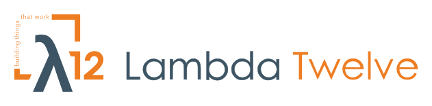
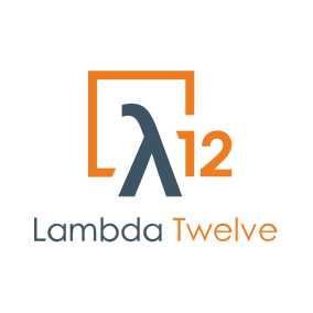
There are four versions of the logo, plus an icon for very small sizes. Each comes in a version for light backgrounds and a version for dark backgrounds.
Square
The registered trademark, and the default choice. If in doubt, use this one.
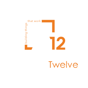
Square with tagline
The frame carries the tagline "building things that work". For large pieces only (see minimum size).
Horizontal
For wide, short spaces: website headers, email signatures, sponsor strips, slide footers.
Horizontal with tagline
For wide banners and large headers only.

Choosing a version
Pick by the shape of the space and by who controls the final size.
| Situation | Use |
|---|---|
| Supplying a logo to a third party (event organisers, partners, press, directories) | Square. Include the horizontal version if they ask for a wide format. Do not send the tagline versions: you cannot control how small they will be shown. |
| Square or tall spaces: stickers, merchandise, badges | Square |
| Wide, short spaces: website header, email signature, slide footer, sponsor strip | Horizontal |
| Large pieces we produce ourselves: roll-up banners, booth backdrops, posters, full-screen slides | Tagline versions, if they meet the minimum size. Otherwise use the version without the tagline. |
| Favicons, app icons, social media avatars | Icon. Use the icon only where the full logo cannot be read; wherever there is room, use a version with the wordmark. |
Clear space
Keep an area around the logo free of text, images, other logos and the edge of the page or screen. The unit is x = half the height of the "12". Leave at least x on every side of the artwork. Because it is measured from the logo itself, it scales with the logo.
Clear space (x on every side)Artwork
The files already include the clear space. Every SVG has at least x of empty margin built in, and the square file has more. Place the file as it is and do not crop it: then nothing can get closer than the minimum.
This is a minimum. Where there is room, especially next to other logos on a sponsor wall, leave more.
The icon is the exception: it has only a small margin so it can fill a favicon or app-icon square. Where a platform crops avatars to a circle, check that the frame corners are not cut off.
Minimum size
Below these sizes, parts of the logo stop being readable. Sizes are the width of the whole file as supplied, including its built-in margin.
| Version | Screen | Print, read up close | Signage, read from a distance |
|---|---|---|---|
| Square | 100 px wide | 25 mm wide | — |
| Horizontal | 120 px wide | 30 mm wide | — |
| Square with tagline | 350 px wide | 90 mm wide | 35 cm for every 3 m of viewing distance |
| Horizontal with tagline | 780 px wide | 200 mm wide | 80 cm for every 3 m of viewing distance |
| Icon | 16 px wide | 5 mm wide | — |
If a piece cannot reach the minimum for a tagline version, use the same layout without the tagline. Never make the tagline bigger or bolder to compensate.
Colour
The logo uses two colours, plus white in the dark versions.
Print colours. The CMYK values are the ones used for the 2023 business cards, which were printed and approved. Use them as given, rather than letting software convert the HEX values again. On dark backgrounds, the business cards print the "white" parts as a very light cool tint (CMYK 5 3 1 0) instead of leaving bare paper; either is acceptable. There is no Pantone (spot colour) value yet. If a job needs one, ask the printer to match the orange to a printed business card and approve a proof before the full run.
The logo can also be used in a single colour (all blue-grey, all black or all white) where a process only allows one colour, for example engraving, embroidery or single-colour screen printing. Those files do not exist yet and will be made when needed.
Backgrounds
Use the light versions on white and light backgrounds, and the dark versions on dark backgrounds. Always place the logo on a plain area.
Contrast is shown as a ratio: 4.5 or more reads well, and 3 is the usual minimum for graphics. The orange on white is slightly under 3 : 1. That is common for orange brand colours and acceptable for the logo itself, which is large and has the blue-grey to anchor it. Do not use the orange for small text on white, though.
| Background | Version | Blue-grey / white parts | Orange parts | Guidance |
|---|---|---|---|---|
White #FFFFFF | Light | 7.9 : 1 | 2.8 : 1 | Recommended |
Black #000000 | Dark | 21 : 1 | 7.6 : 1 | Recommended |
Near-black #121212 | Dark | 18.7 : 1 | 6.8 : 1 | Recommended |
Dark slate #1E2A33 | Dark | 14.6 : 1 | 5.3 : 1 | Recommended |
Lambda blue-grey #3C5463 | Dark | 8.0 : 1 | 2.9 : 1 | Used on the business cards. Fine in print and at large sizes; the orange looks flat at small sizes on screen. |
On mid-tone backgrounds, choose whichever version gives the clearer result. If neither does, put the logo on a white or dark panel instead of placing it straight onto the background.
Typography in the logo
All lettering in the logo is artwork, not typed text.
- Wordmark: "Lambda Twelve" is drawn lettering in the style of Century Gothic. Always use the supplied files and never retype the name in a font to imitate the logo.
- Tagline: "building things that work", set in Avenir Next Regular, all lowercase, and converted to outlines. The wording, case and placement are fixed.
Incorrect use
Do not change the logo in any way. These are the most common mistakes.
 Free coffee and stickers for everyone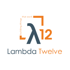
Also do not
- Rearrange, resize or remove parts of the logo, or build new layouts from its parts.
- Change, translate or retype the tagline, or add a different tagline.
- Recreate the logo from a screenshot or a low-resolution image. Always start from the supplied SVG files.
- Crop the files or put a frame or box tight around the artwork.
Files and trademark
All files are vector SVGs with every letter converted to outlines, so they scale to any size and do not need fonts installed.
| Version | Light backgrounds | Dark backgrounds |
|---|---|---|
| Square | lambda-twelve.svg | lambda-twelve-dark.svg |
| Square with tagline | lambda-twelve-tagline.svg | lambda-twelve-tagline-dark.svg |
| Horizontal | lambda-twelve-horizontal.svg | lambda-twelve-horizontal-dark.svg |
| Horizontal with tagline | lambda-twelve-tagline-horizontal.svg | lambda-twelve-tagline-horizontal-dark.svg |
| Icon | lambda-twelve-icon.svg | lambda-twelve-icon-dark.svg |
If a tool cannot open SVG, export a PNG from the SVG at the size you need rather than scaling up a small PNG.
Trademark
The square logo is a registered trademark of Lambda Twelve in Greece. The other versions are variants of it for use in different formats. Using the logo does not transfer any rights to it.
Contact
For questions about using the logo, other file formats, or uses these guidelines do not cover, email hello@lambda-twelve.com.
Lambda Twelve logo guidelines · Version 1.0 · September 2026